May 15, 2012
Digital AuthentiCity
By Carola Moujan
The rapid development of ubiquitous computing has triggered an ever-growing demand for digital displays in contemporary urban environments. A broad range of new objects is coming to light; from interactive billboards to smart bus stops, it seems as if every object was bound to become digital. The scope and form of such objects, however, is difficult to define; lacking a formal paradigm to lean on, new urban furniture inherits the language and structure of other digital objects that do not necessarily suit the particular use and context the city requires. A tactile urban surface, for instance, will be alternatively envisioned as city wall, as big tablet or telephone, as a website on the street... Simply put: these new objects arrive in the urban landscape without a clear definition of their function, and in most cases, without in-depth reflection on their form.
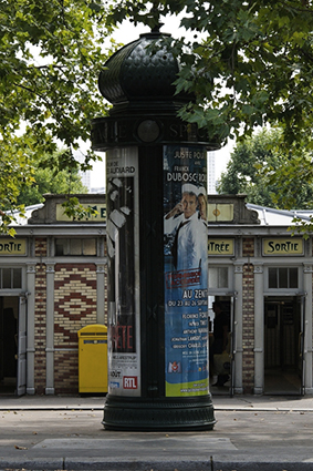
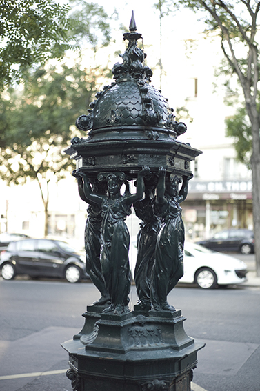
The consequences of this lack of form concern above all the shaping of a city’s identity. Two aspects converge here: on one side, the form of urban furniture contributes to creating such identity. Haussman’s Paris is paradigmatic in that respect; its typical objects –Morris columns, Wallace fountains and Music kiosks– countlessly reproduced all over the world, not only constitute intrinsic elements of Parisian identity but have become icons of Paris itself. Conversely, the amorphous digital objects of today violently question such constitution; they cannot be perceived as authentic, for their form is both unstable and undefined, and does neither clearly correspond to a specific function nor is linked to a particular place. Instead of consolidating it, they challenge and weaken urban identity.
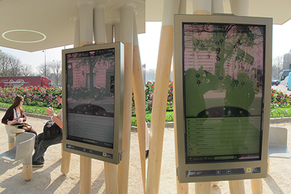
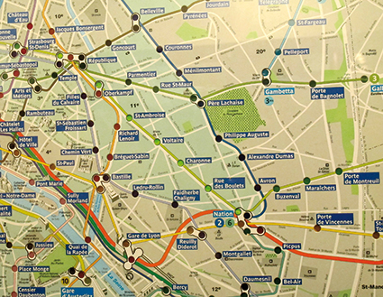
A good illustration of these issues can be found in the tactile orientation maps currently being tested in the Parisian metro network. These displays are meant to replace in the near future both the printed maps of neighbourhoods and the analogue interactive consoles from the 60’s that can still be seen in some stations. These objects work as follows; when the user pushes a button, all the stations from the starting point to the desired one light up. This very simple, low-tech system turns out to be both extremely efficient (it quickly shows the shortest way to get from one station to the other) and very pleasurable –there is an immediate, non-intellectual satisfaction produced by the line of points lighting up.
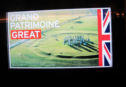
The digital panel instead, far more sophisticated, provides multiple functions such as a place finding tool, a neighbourhood map, a list of remarkable places nearby, panoramic views of the street outside, and many other features. At first contact with the object however, two issues strike the user. First of all, these interactive displays can hardly be distinguished from the non-interactive, non-informational advertising billboards nearby. Both types of objects are extremely similar, and the only way to tell them apart is by looking at the content; in the case of the interactive map, a “touch me” phrase written in different languages suggests the possibility of tactile interaction.
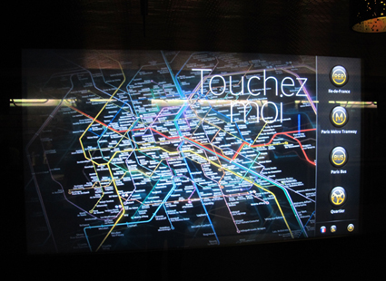
The second issue is even more puzzling: when searching for a specific station, the itinerary suggested by the digital system often turns out to be longer and more complex than the one provided by the analogue console, in spite of –or perhaps, because of– its higher technological sophistication.
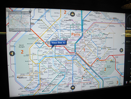
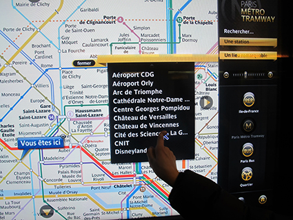
In spite of its simplicity, the forms provided by the analogue console are both efficient and pleasurable, and its objects are much richer and more authentic compared to the digital. Just as with Morris columns and Wallace fountains, by simply looking at the object one immediately understands its purpose –i.e. finding metro stations and itineraries. The interactive elements are clearly identified as such, and feedback is direct and sense-based: we feel the pressure of the button under our fingertips and see the light dots turn on. No need for symbols, translations or explanations. Conversely, the digital display’s forms are ambiguous.They resemble the objects – however, despite their multiple functions, interactive elements are hard to recognize without reading the labels. Undoubtedly, the digital map is a more complex tool enabling more sophisticated and complex uses; and the new possibilities offered by digital media can indeed be efficient and provide a certain type of, albeit different, pleasure: while the analogue console provides satisfaction through direct, sensorial stimuli, the digital pleasure is mostly related to an increased feeling of virtual mastery of space. Hence, on a physical level, its functionality comes at the price of sensorial impoverishment.
Moreover, on a symbolic level, the illusion of mastery provided by this (often inaccurate) system, combined with its formal similarity with the advertising billboard, raises questions about the values these devices ultimately convey. Following John Dewey’s definition, the digital device is artificial; not because cutting edge technology is used, but because “there is a split between what is overtly done and what is intended. […] Wherever the split between what is done and its purpose exists, there is insincerity, a trick, a simulation of an act that intrinsically has another effect.”[1]. One wonders if this dichotomy between functional sophistication and sensorial quality is inevitable, or whether alternative ways of envisioning digital information might exist, both in terms of sensorial experiences and of transmitted values.
We therefore need to identify, beyond technological fascination, under which conditions a digital display is an evolution in comparison to already available systems. Not as a nostalgic rejection of progress, but rather, as a questioning of what can be truly called innovation. In other words: we need to find out where digital authenticity might lie. The real issue is not how analogue buttons can be converted into digital ones, nor about making raw data accessible to all, but about understanding where urban authenticity lies, and the way in which the specifics of digital technologies could help us enhance our conception of it. Last, but not least, it’s about understanding potential strategies to leverage such authenticity in the direction of democracy and true ownership and away from gentrification, a phenomenon that, by transforming true authenticity into a market value, cuts off neighbourhoods from their life source and ultimately destroys the social dynamics that gave it birth.
Seen from the perspective of content, it is even more evident that the notions of authenticity and democratic representation are at stake when comparing the analogue and the digital paradigms. There is a growing tendency to rely on the paradigm of a centralized information system where digital displays are envisioned simply as distributing terminals. This vision basically considers the city in quantitative terms; it's all about locating services, monuments, and streets. Since every city contains such elements, the same system can be applied to all of them. This reductive and materialistic view, however, overshadows everything that is dynamic, immaterial, and alive within urban space: relationships between infrastructures, immaterial energies and resources such as human networks and activities, dynamics of change, actors and activities that constitute the very soul of the city.
While there is at all times a huge surplus of available information, what is missing here is not quantity. Nevertheless, the possibility of accessing an ever growing quantity of data is presented as an absolute advantage and simultaneously a sufficient compensation for what we give up. More information available, more ways of accessing it, more “interaction” –understood as more simulations of buttons. The loss happens on the qualitative level, and it happens precisely because quality is not even discussed as a possibility.
Urban information displays propose a reading of the city that expresses the values and agenda of the content provider. Even though this is also true for analogue devices, the main difference with digital ones is the latter’s higher simulation capacities, clearly illustrated by Google Street View and similar orientation systems based on panoramic views. Such simulations have a particularly uniform aesthetic quality derived from the requirements of their production process –i.e., the same horizon, lens angle and lighting conditions are systematically used to make the image sequences match. The resulting effect is both overly smooth and seemingly realistic –a seductive quality that makes those views look familiar even when the user has never seen the place. Seamlessly, they are becoming acceptable substitutes of true views of the city, replacing the real, complex texture of the city by smoothened images of it. Of major importance here is the fact that those images, in spite of their artificial nature, are presented to us as if they were real views.
Substituting real views of the city by sterilized images means concealing precisely what makes a place authentic. I will argue however that beyond simulation, the true potential of digital urban furniture lies precisely in authentication. In place of displaying centralized, sterilized, top-down information, the exceptional flexibility of digital technologies could be used to reveal authenticity, giving visibility to content that falls outside mainstream information, thus creating context awareness –let this be street art, communal activities, this week’s brocante or the local school’s parade. Moreover: beyond static information, digital urban furniture has the potential to reveal relationships between actors, showing the living forces at play within a city. This could help enhance the condition Walter Benjamin stated to be the one of a truly authentic city: the experience of origins, not just its narrative. It could also be a useful tool to reclaim ownership and the right to the city for its inhabitants. In the words of Sharon Zukin “Claiming authenticity can suggest the right to the city, a human right, that is cultivated by longtime residence, use, and habit. Just as icons – in the original, religious meaning of the word – derive their meaning from the rituals in which they are embedded, so do neighbourhood, buildings, and streets...” [2]. While authenticity is often used as “a lever of cultural power for a group to claim space and take it away from others without direct confrontation, with the help of the state [...] elected officials and the persuasion of the media”[3], we can instead, through digital technologies, make origins visible in order to keep them alive and strengthen true ownership.
Content production and design are the main levers of digital authenticity. When instead of top-down communication terminals distributing official or corporate messages only, urban screens will become a space where civic expression can have its place among other social, economic and political forces, the content can become unique and authentic. Design, on the other hand, is essential at different levels: to make sense out of diversity and profusion by proposing urban readings that respectfully organize and make content accessible; to create inclusive interaction modes that address the whole social spectrum including marginal, disabled and aged people; to reinforce local identity, reduce visual chaos, enable rich sensorial experiences within the urban space; in short: to give form to an urban furniture that, beyond function, acts as an agent of collective well-being.
Carola Moujan is a Paris-based independent designer, artist and writer, currently a Ph.D candidate at the Université Paris 1, Panthéon-Sorbonne.
[1] John Dewey, Art as Experience, Penguin Books, London, 2005, p. 65. Original work published 1934.
[2] Sharon Zukin, from "Naked City: The Death and Life of Authentic Urban Places”, Oxford University Press, New York, 2010, p. 244.
[3] Ibid, p. 246.


